Color palettes can feel personal, especially when you’re talking about residences, which presents a challenge when you’re in charge of choosing a color palette for multiple residences, as is the case with apartment buildings. Designers follow several guidelines for choosing palettes for any space, but a good source of inspiration is nature.
Start With a Warm Neutral
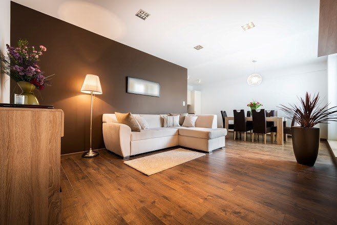
To make a space appealing to most people, you want to generate a sense of warmth with the paint. What’s more, you don’t want to get too bold in your choice. Therefore, your base color, the one that will be featured the most, should be a warm neutral.
Nature provides many sources of inspiration for this color. Any light earth tone will do. Look at the graining in a wooden plank to find a comforting color. Honey could also be a choice with a slight sense of boldness — this hue might be well-suited for kitchens or shared community spaces. If you want any coastal influence at all, consider a sandy shade as your base neutral.
Look at Shades of Green
When you think of nature, one of the first colors that comes to mind is probably green. The color is synonymous with nature because most plant life features some shade of green. The vibrant green you associate with grass and leaves is probably the dominant color in your imaginings. However, such a bright shade would probably be too bold for your communal residences.
Look instead to some more subtle plant life. For instance, look at a flower garden. You might find some light shades of green near the petals. You could also look at fruit or other food for inspiration. For example, olive green is a shade commonly found in communal areas.
Consider Shades of Blue
The other main color associated with nature is blue. The color is right there in the sky. Blue flowers and even some fruits are also common. What’s more, if you’re looking at any kind of coastal theme, blue is essential to your palette.
Indeed, unlike with green, you’ll want to choose a theme when you approach blue shades. You don’t have to be as targeted as “Cape Cod chic,” but have an idea about what general effect you’re going for. If you have at least some preference for, say, wildflowers instead of the beach, then you’ll know what range of blues to consider.
Experiment With a Bold Accent Color
Generally speaking, three colors make up a cohesive and workable color palette. Designers often follow a ratio rule of 60-30-10. Your main color — in this case, your warm neutral — would provide 60% of the color scheme. The painters would probably use it for the majority of the walls. You’d choose one predominant accent to use 30% of the time and one secondary accent color for the remaining 10%.
That said, you want your apartment building to stand out from other rentals, so don’t be afraid to look to nature for some bold inspiration. For example, if you’re looking at a flower garden, you’re likely to see bright hues in the blooms. A rich purple, bright fuchsia, or sunny yellow could serve well as an accent wall, say behind your reception desk or elsewhere in the foyer.
Blend the Palette Into a Cohesive Color Scheme
You want to make sure your whole palette works well together. You should have some connection between the colors. You may have noticed that the above advice recommends looking at specific examples in nature. Well, what Mother Nature has provided usually looks pleasant to people.
For example, you could start with a beautiful picture, say of a national park or a garden. You could choose shades found within the picture for your base, accent, and bold colors. Because it’s a natural palette in itself, the colors will have natural harmony with each other.
Make your apartment building stand out with a nature-inspired color scheme. Contact Trend for professional, personalized painting services.