Imagine walking into a room and instantly captivated by the harmony of colors that greet your eyes. The walls, the furniture, the little accents—everything flows together in a symphony of hues, creating an inviting and impressive atmosphere. This is the power of a perfectly coordinated paint job.
But how do you achieve such a feat? It’s not about slapping on any color that catches your fancy. It’s an art that requires understanding, practice, and a keen eye for detail. This guide will unravel a few color coordination secrets and offer practical tips to help you transform any space with a masterful paint job.
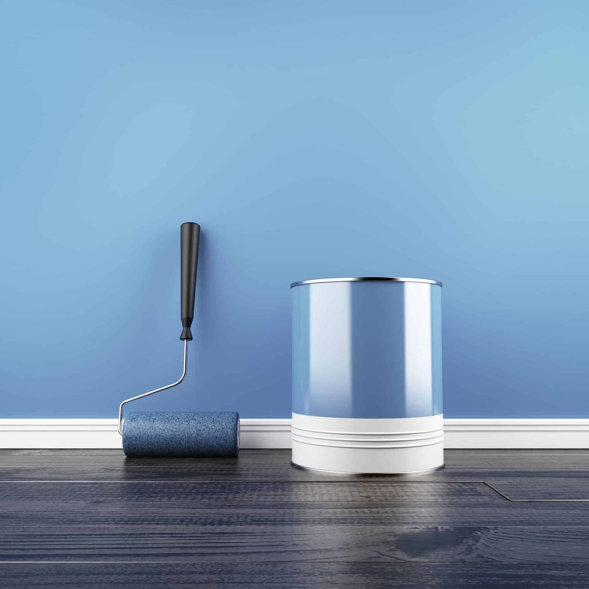
Choose a Color Palette
Choosing a color palette is an essential first step in achieving a harmonious color scheme for your paint job. A well-curated palette provides a cohesive guide for blending different colors, ensuring that they complement rather than conflict with each other.
It creates a roadmap of sorts, helping you visualize how various hues interact and how they can be used together to evoke a particular mood or aesthetic. For example, a cool blues and greens palette can create a serene, calming environment, while vibrant yellows and reds might instill a sense of energy and vigor.
In addition, a predetermined color palette simplifies the decision-making process. With a multitude of hues available, choosing the perfect color can be a challenge. A palette narrows down your choices, making it easier to pick colors that work well together. It eliminates the guesswork and reduces the risk of ending up with a jarring or inconsistent look.
Remember, a good color palette can be the difference between a balanced, visually pleasing space and one where colors clash and distract the eye. Hence, thoughtfully selecting a color palette is crucial for achieving a well-coordinated paint job. If you’re unsure which colors work well together, check out inspiration boards online or consult a qualified painting expert.
Play With Contrast
Contrast is a vital tool in creating a visually exciting space. It provides depth and dimension to ensure the space doesn’t appear flat and monotonous. Furthermore, contrast can highlight architectural features or focal points within a room, guiding the viewer’s eye and adding an element of surprise.
For example, a bold, dark color on a feature wall can draw attention and act as a dramatic backdrop for artwork or furniture. Alternatively, highlighting moldings, window frames, or doors in a contrasting hue can create an elegant, design-forward look that livens up a room.
Using contrast effectively doesn’t mean you have to choose extreme opposite colors. Even subtle changes in shade can make a difference. For instance, when working with a monochromatic color scheme, you could play with different tones and tints of the same color to add interest and depth. Similarly, contrasting finishes (like matte and gloss) can also introduce a sense of contrast and variety.
Remember, the objective of playing with contrast is to balance out spaces, create depth, and add a dynamic element to the overall aesthetics of a room. So, have fun experimenting and using color to bring your design visions to life!
Use the 60-30-10 Rule
The 60-30-10 Rule is a classic principle in interior design that provides a balanced color scheme for any room. It stipulates that 60% of the room should be a dominant color, 30% a secondary color, and the last 10% an accent color.
The dominant color is typically a neutral tone that sets the room’s overall tone. This helps ensure the room is not overwhelmed with too many intense colors. The secondary color is then used to provide a contrasting element and is usually bolder. The accent color is the most vibrant and is used sparingly to create visual interest and focal points.
Adherence to this rule ensures that colors are balanced and no single hue overpowers the others. The different color proportions allow for zones of interest without causing visual chaos. Regardless of your design expertise, you can easily achieve a professional, aesthetically pleasing look.
Talk to us at Trend Building Services for more tips and expert help to create color harmony in your space.